An Interview with Ambigram Master John Langdon

Let's keep things interesting, shall we? This week's blog post is the first in a series of interviews that will be mixed into my regular posting.
One thing I've noticed among beginner designers is their lack of understanding and appreciation for history and fundamentals of graphic design & type. In an effort to provide context and compassion for our industry's roots, I am reaching out to my knowledgable mentors and friends to talk about their experiences, their processes, as well as their personal lives. This week: Professor John Langdon.
You may not recognize John's name, but you most likely have seen his designs from the Dan Brown books or on logos for musicians such as John Mayer and Aerosmith.
John has had a profound impact on my career thus far, as well as many of his other past students. This was especially apparent when two weeks ago, a large group of colleagues and past students gathered to celebrate his farewell from Drexel University's Graphic Design Department.
With 25+ years of teaching, and 40+ years of having fun with letters, John was kind enough to share some of his knowledge in our conversation. Let's dive in.
Where did you grow up and what are some childhood memories you have?
I was born in Wynnewood, PA and most of my childhood memories have to do with sports. I remember my father teaching me how to bat – I must have been 4 years old. I was around the same age when a neighbor watched me coloring and told my mom that she thought I would be an artist. I remember thinking to myself, “That’s right.”
Did you go to school for design?
I went to Dickinson College, where I played soccer for four years, majored in English and took a few studio painting courses.
One of my main goals at college was to avoid being drafted for service in Vietnam. That accomplished, when I got out, I had no idea what I wanted to do for a living.
I knew I was an artist, but didn’t know that was something one could actually be.
I assumed I’d go into advertising, but with no portfolio or design education, I was unable to find work at an agency.
I wound up landing a job in a related field, working in the photo-lettering department of a type shop, where I learned a hell of a lot about type, and got very focused on logo design. At the same time, I went to PCA (now the University of the Arts) at night, taking drawing and painting courses, and a couple of advertising courses as well.
Through my adolescence, I had done some random visual things with words, and in the late 60s, became obsessed with psychedelic poster lettering. I got a subscription to AVANT GARDE magazine, and soon I was seeking out and devouring everything Herb Lubalin did.
I began designing hand lettered logos for all my friends, made up businesses, and my cat.
After I left the type shop, I got a job at Sulpizio Associates, a prominent Philadelphia design studio. My five years there were my graphic design education, designing hundreds of pharmaceutical brochures, booklets and other drug promotional pieces, a couple of drug logos, and a new logo for the studio. But I couldn’t wait to get out of there.
When my daughter was born in 1975, my wife was already into a good career, so I became a stay-at-home dad, and began freelancing as a logo and custom lettering specialist.

Ambigram sketches for Angels & Demons by Dan Brown
How would you summarize your journey from when you first studied design to where you are now?
Throughout my adult life I have always generated my own projects (like kids do).
My obsession with the yin/yang symbol and my love of M.C. Escher’s graphic mind games led to my developing what we now know as ambigrams.
I sent some of them to Herb Lubalin who was, by then, the editor and design director of the ITC promotional publication, U&lc.
He published a number of the things I sent him. My entry to a U&lc design competition ended up on the front cover of a subsequent issue. I’m sure that helped my fledgling career, but most of the work I was getting was from Philadelphia. Despite a small handful of assignments from New York agencies, and later, inclusions in the prestigious Type Directors Club annual, I never really became one of the insider NY type and lettering guys. But between a steady stream of work from Philly agencies and being a full-time dad, I stayed plenty busy.
After seven years, I realized one day that every piece of professional work I had done was no longer in use. I decided I had to find something that would have a longer term effect. I began teaching lettering at Moore College of Art. After three years, I moved to teaching type courses at Drexel University.
I had continued to create more and better ambigrams all the time, focusing on words that had meaning in both Taoist philosophy and western physics. Wordplay was published in 1992.

Logo for Angels & Demons by Dan Brown
Did you have a mentor figure throughout your career? If so can you talk about how they affected you.
I would have to say no. Lubalin was (unknowingly) my guiding star, but I was just very motivated to be as creative a type-user and letterform creator as he was — especially in an art form (ambigrams) that no one else was practicing, and one that included my developing version of Taoist philosophy.
Lubalin’s finished lettering guy, Tom Carnase, drew incredible formal scripts and I wanted to be able to draw any letter I might think up as well as he drew letters. By the late 70s I had begun to admire and occasionally emulate Gerard Huerta’s extraordinary lettering as well.

Ambigrams for Angels & Demons by Dan Brown
I remember hearing in your TEDx talk about your criticism of 90's design trends and how they were being honored at the Type Directors Club. Do you feel like we have bounced back from that period of poor industry standards?
Well, we’ve certainly bounced away from that low point. 90s grunge and de-constructionist typography came about as enthusiastic users of computer type went far beyond the limits that pre-computer type had lived within. Their lunatic excesses, created with reckless abandon, finally got old, and the counter-revolution took lettering fans back to hand drawn methods and materials.
The venerable art of calligraphy and the more recent practice of chalkboard lettering have become very popular. But I don’t think that typography has bounced back to the rarefied pinnacle that 1980s ITC fonts reached. There are certainly highly-talented and devoted people drawing type these days with the extreme care of traditional type designers, but I’m disappointed that they are mostly drawing sans serif forms with little or no personality, most of which are staying very close to designs of the mid 1900s.
Aesthetics and craft are paramount again, but they have not yet been married to innovation. Undoubtedly, some will disagree with my opinion.

Logo design process for Typedia (the encyclopedia of typefaces)
Can you explain your quote, "History doesn't repeat itself, but it rhymes" as it relates to typography and lettering?
My slight paraphrase of Mark Twain’s quote can probably be applied to any field of endeavor. In the world of type design, the rhymes seem to accompany the revolutionary changes that type technologies have gone through as they’ve evolved. Lettering text by hand faded away as Gutenberg’s moveable type proved to be an enormous leap in efficiency.
"History doesn't repeat itself, but it rhymes."
While gothic blackletter predominated in the early years of printing, type designers throughout Europe explored highly distinctive styles. Lead was essentially the only material used to create type for over 400 years, but its weight made it impractical to meet the demand for increasing larger type in the Industrial Revolution (for advertisements). Letter-heights of several inches to more than a foot required making type out of a lighter material — wood.
The exuberance over the ability to create type by a faster and cheaper method led to letters of outrageous weights and proportions, that we now associate with “Wanted” posters. Lead and wood were used side-by-side for another century, but were supplanted in the 1950s by the even lighter, cheaper and faster use of photographic film and paper. By the 1960s new photo lettering typefaces began to follow the groovy influences of psychedelic lettering. And the democratizing influence of the computer allowed people with no understanding of or respect for type history brought us “Not Caslon” and other typographic atrocities in the 90s.
Whenever type can be produced more quickly, more cheaply, and in less time, crazy shit happens.
The craziness doesn’t repeat the styles, but goes through the same developmental steps.

All images © John Langdon
Can you describe how your philosophy plays into your creative work?
I have come to see that everything in the universe exists in a state of elegant balance of complementary opposing forces. In design, as in aspects of other art forms, I am enthralled with the use of extreme contrasts — size and weight contrasts, density and emptiness, serifs and sans serifs, horizontals and verticals, etc. The obvious oppositeness of yin and yang play out in design to create harmony, beauty, and, judiciously applied, can yield efficient and effective communication.
I have come to see that everything in the universe exists in a state of elegant balance of complementary opposing forces.

All images © John Langdon
How long did it take for you to feel confident in your personal values and philosophies? Were you always this self-aware?
I think I’ve always been self-aware, but for a long time, I felt self-aware about what I perceived to be my shortcomings. Earlier in my life, I was insecure about much of life, but I found that becoming really good at things I loved (soccer, baseball, wordplay, drawing) gave me confidence in what I could do.
When I showed art directors my portfolio in the 70s and 80s, I was insecure about “selling” my work. So I never talked their way through. I just put my work in front of them and let it speak for itself. Some people didn’t get it, but eventually enough did (thanks, Herb!) that I’ve been able to make a career out of doing what I love.
Love leads to time and effort spent, which leads to greater ability, which leads to success.
Looking back, what was one of the biggest challenges in your life/career?
Dealing with my insecurities. Dealing with people whose egos caused them to flex their circumstantial superiority over me. Authority figures. (Did I mention that I work alone?)
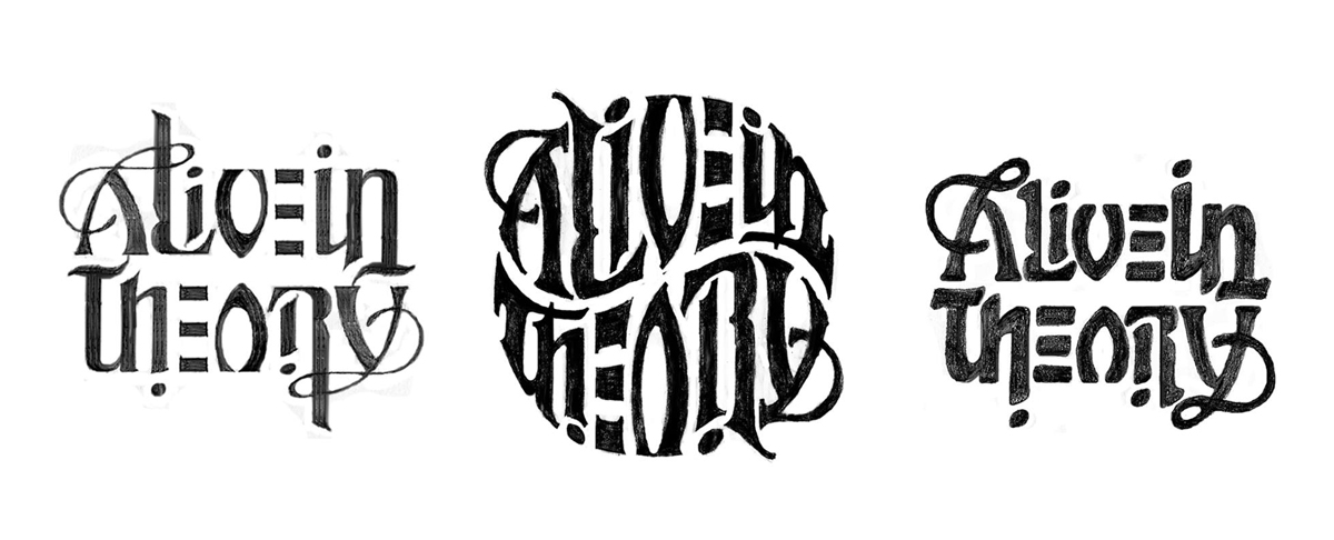
John's ambigram logo sketches for the band Alive in Theory
Was it difficult to adapt to all of the technological changes that have happened over the last few decades?
From the early 70s to the early 90s, I was perfectly happy working with paper, pencil, technical pen, white paint, and rubber cement.
I was very reluctant to leave that behind in favor of sitting behind a computer. At first I hired my students to execute my designs in Adobe Illustrator. Essentially, I learned to use it by sitting behind them, telling them how and where to move their hand. I have now LOVED Illustrator for twenty years.
The design world seems to be totally different these days than what it was even just a few years ago. Can you name one or two things that have remained as prominent as they always were?
I agree. Maybe the demand for design has remained rather constant, but the internet has probably caused that to increase, too. The demand for print has held on, but the number of vehicles and gadgets where people experience design have mushroomed. We really have become a much more visual society in recent decades. Maybe my short answer is No.
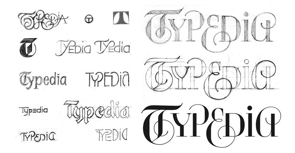
Logo design process for Typedia (the type excyclopedia)
What do you feel like is missing from design education today? Or what do you feel like is really important to learn while you're a young designer?
It could be that I’m showing a bias here, but I have felt for some time that type does not get the emphasis it should. Unlike any other facet of graphic design, type is a present element in every single thing that we create. Font creation now has amazing capabilities built in, so that default setting is pretty damn good, but a lot of students and, apparently professionals as well, are perfectly comfortable using default settings without even looking at what’s there on the page. By contrast, I’ve been working on a book project lately where my text font is set 22/29, horizontally scaled at 97% and tracked at -5. To me, it matters.
I’m convinced that designers need to know type history in order to be truly excellent designers... it can help determine why a certain style is right or wrong for a project, and how it is best used.
You've told me before that you have managed to somehow "make a career by being yourself". Can you break down what you meant by that?
Well, I think several of my previous responses do that. It comes down to focusing on what I love, and working my ass off to get very good at what I love. The world wasn’t sitting around eagerly awaiting ambigrams, and people who saw my early ones — even my best early ones — had no clue as to what value they might have.
Even I thought that they had no commercial value, and so I regarded them as an art form. But I got really good at creating them, and a publisher thought they had value as material for a book. And then Dan Brown saw that book (Wordplay) and thought they had great potential value to his writing Angels & Demons. Today, innumerable people are getting ambigrams inked on their bodies.
Beyond my creative work, I found that I loved teaching, because I was able to develop a parental kind of love for my students.
The world wasn’t sitting around eagerly awaiting ambigrams, and people who saw my early ones had no clue as to what value they might have.

Logo design process for the band Aerosmith
What are you looking forward to most when you move later this year to the West Coast?
1. A better climate than eastern Pennsylvania.
2. Living rurally near a small town that’s big enough to have some culture. I’m looking forward to painting, writing, and having the occasional commissioned design project.
Any other advice or wisdom you would like to share with the young designers out there?
Love what and who you want, openly and actively. Treat everyone as having equal value in the world.
Don’t look at clients, or anyone, with fear or awe.
Don’t treat your suppliers as servants. Get back to them after the job is complete, and thank them for helping to make it a success. If you have co-workers, treat them as collaborators rather than annoyances. Appreciate nature, and learn from it. Appreciate people, and learn from them. Gobble up the innumerable and delicious opportunities to observe and enjoy ambiguities.
What are some things that make you feel grateful in life?
I’m grateful to have been part of it. This is an amazing world and universe. I’m grateful for having been a small part of so many people’s lives, especially my students. And I’m very grateful for the existence of peanut butter, and all the great things you can do with it.